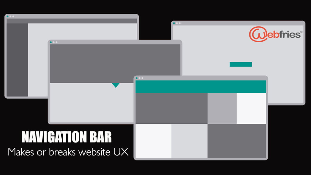
This is the most overlooked designing phenomenon overall. Designers have taken a deeper plunge into designing aspects and usage of the right colors, very recently and the virtual transportation across the site might need far more insistence. Your organic visitors tend to dump your website forever in case they feel lost and not seem to GPS they wish to be. Use simple navigation tricks to have your visitor waltz around your site comfortably.
Welcome!
Majority of Indian sites open with a banner image. A banner without a click action will annoy a customer who is impressed by the banner content but has nowhere to go beyond it. An e-commerce website has the scope of selling out their banner displayed products if their click action navigates the user spot-on to the product, instead of a “related products” display. A single banner with multiple click actions, offering options to navigate across, can turn a visitor into a buyer.
Where is the Menu?
With the hamburger icon gaining popularity, our Indian audience still prefers traditional text navigation tools. Viewers automatically look to their left first and your menu being “unrecognizable” under the guise of 3 horizontal lines can leave your customer click the X icon. Let us be progressive; however allowing the visitors to take their time. Let your icons transform into texts once they move their cursors across the screen. Educating your viewers is equally important as innovating UX designing. The tastiest cake deserves dessert lovers to devour!
Collections / Categories / Services!
Your company may be building products and services that can outnumber any of your competitors. It is important to sophisticatedly flaunt this to your customers. While you wish to sweep them off their feet and take them across your palace room by room. List your company’s best in an understandable line of order where the user gets an overview of your company and also has the freedom and comfort to know more of only interested services/products.
How big is your company?
Your digital presence needs to reflect the actual picture. A start-up may kickstart on a low scale, however, a website is integral. Space your content and services across a single page without complex navigations if you have little to say. Concentrate on effective scrolling and content placement. Though the users are forced to scroll across the complete site to get to know your company, present the text icons or pictorial icons in case your visitor is impatient to simply scroll down. Do not create complex navigation tools as a virtual-ego fix and create a fake impression for your visitors. When they reach the end of the screen, probe them to click Contact us, that is the goal.
For any E-commerce development or portal web development work in which Menu bar has a tremendous role to play, contact Webfries today which is a website development company in Gurgaon. Talk to you @ +91 124 4382-633| check us on www.webfries.com.


